[New search]
[Printable PDF version]
[Help]
Ronald P. Loui
|
Table of Contents:
|
Cite as: R. P. Lou, "A Modest Proposal for Annotating the Dialectical State of a Dispute", (2008) 5:1 SCRIPT-ed 176 @:
http://www.law.ed.ac.uk/ahrc/script-ed/vol5-1/loui.asp
Download options |
 |
 |
| DOI: 10.2966/scrip.050108.176 |
|
© Ronald P. Loui 2008.

This work is licensed under a
Creative Commons Licence.
Please click on the link to read the terms and conditions.
|
1. Introduction
This
essay reports on the evolution of our computer-supported argument
diagramming and argument visualisation practices, as scholars of
argument, and also as computer scientists interested in supporting
the diagramming of argument. We begin with the Toulmin diagram,
describe efforts to avoid boxes and arrows by using encapsulation,
and efforts to depict the logic of legal argument from precedent.
Our aim is to provide a theory of argumentation and a theory of
legal precedent, and to provide visual correspondences for the
logical rules. It is not our principal aim to provide tools for
persuasive use, e.g., in a court of law. In the end, new
possibilities for using text decoration and markup, dynamic text
animation and interaction, and visual metaphor are envisioned. The
possibilities are so rich that the final examples border on satire.
2. Toulmin
My
starting point is the Toulmin diagram for visualising the structure
of defeasible arguments. But I have some reluctance because I
believe that this Toulmin kind of argument-diagramming is of limited
relevance to those who have practical persuasive legal needs. The
dialectical diagramming that my colleagues and I discuss in the
theory of argumentation, after Toulmin, is mainly a device for
elucidating logical structure. Our uses of these diagrams are for
theorising, not persuading.
In
an earlier paper with many co-authors,1
I referred to Toulmin diagrams as “a spaghetti of boxes and
arrows.”2
Many people in the CSCW (computer-supported collaborative work)
community had been writing on the user interfaces that they had
created based on Toulmin's box-and-arrow diagram, and there seemed
in the early 90’s a plethora of programs available to support
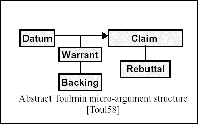
the manipulation of such box-and-arrow diagrams. Of course, one
draws a Toulmin domino when one wants to connect the supporting
claim to the claim it supports, and there is nothing wrong with one
Toulmin domino (three or four boxes and two or three arrows) by
itself. The problem is when many Toulmin dominoes are connected.
Since there is no prescription for the layout of the various boxes
and arrows, one must rely on the discipline of the user to create a
visually understandable diagram. As boxes and arrows proliferate,
it is not clear whether even the most disciplined arrangements of
Toulmin are cogent, or even comprehensible.


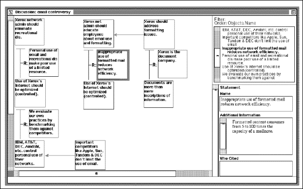
(from
Marshall)3
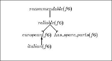
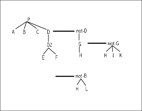
Meanwhile,
we had been diagramming arguments as trees, where the main claim of
the argument sat at the root of the tree, and the unsupported claims
sat at the leaves of the tree. (Trees were drawn with the root at
the top of the page, as computer scientists prefer.) A defeasible
connection between the children of a node and the node was made
implicitly. Toulmin instead would make a box that explicitly stated
this defeasible connection. By convention, if a node labeled p had
children labeled a, b, and c, then the required logical connection
was “if a, b, and c, then defeasibly p.” This was
perhaps the most common diagramming of arguments in the literature
in the late 90’s.
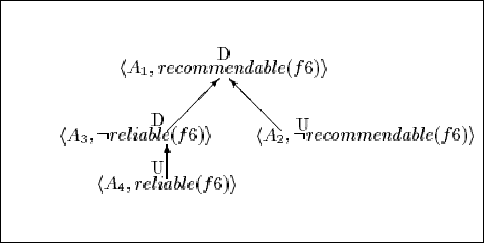
As
several arguments might particpate in a dialectical structure, where
one argument countered another, and a third countered it in turn,
seeking to reinstate the first argument, we would draw a second tree
showing the relationships between the arguments. Some would call
this the meta-argument tree, or the inter-argument tree, because it
showed how the arguments related rather than how the arguments were
constituted.


(from
Chesnevar)4
My own
preference was to combine the two diagrams, so that dialectical
relevance had a left-to-right discipline, and support was top-down.
Alternate arguments would also be listed top-down, but would not be
confused with support since each alternate argument would be its own
tree, connected within itself, but not connected to the other tree.


If one
insisted on comparing this to a Toulmin diagram, there were several
differences, all working in our favor and against Toulmin. First,
the largely redundant warrant and backing boxes would not be
explicitly shown. If an attack were made against a warrant, then
the warrant could be added at that time, or a counterattack would
simply be aimed at a link instead of a node. Nothing prevented
putting the names of cases or statutes on links, for example, and
warrants are often citation references rather than textual
statements. In any case, it was useful not to double the number of
boxes unnecessarily.
Second,
the arrangement into columns was a required part of our regimen.
Alternate columns would represent pro and con, so that any argument
in the second and fourth columns would presumably be adversary to
the position taken in the first column. Reading left-to-right would
reconstruct the dialectical dialogue in a logically useful way.
Third,
there was no explicit requirement that a counterargument link to the
exact node that was its logically contrary proposition or claim.
This could be done, but indeed would promote spaghetti. It was
sufficient, it seemed, to link the argument to its preceding column,
wherein one would find the object of the argument’s attack
(possibly with some effort). Since the number of arguments in a
column and the number of claims in an argument presumably would not
be too large, the connection could be made easily simply by visually
scanning for a negation. Even without locating this contrary
proposition in the prior column, it was knowable simply by negating
the claim at the root of the counterargument tree. Indeed, the
heavy dotted line served as much to indicate a new, alternate
attack, as to indicate, redundantly, that its relevance depended on
something claimed in the prior column.
While
this style of recording dialectical structure was intuitive, it
actually clashed with the conventions of Rescher5
and the dialogue logicians, who preferred dialogical time to run top
to bottom, and to intertwine support, challenge for support, and
rebuttal. The logical exchange under Rescher would appear as:
|
PRO
|
CON
|
|
P
|
why
P?
|
|
A,B,
C, and D
|
why
D?
|
|
D2
|
why
D2?
|
|
E and
F
|
not-D
|
|
why
not D?
|
G
|
|
why
G?
|
H
|
|
not-G
|
why
not-G?
|
|
H, J,
and K
|
not-B
|
|
why
not B?
|
H and
L
|
It is
compact and can be written without graphical artifacts, but it does
not display the argumentative structure, nor even indicate whether a
move is sufficient. Rescher-form is in some sense the textual
locutionary form that the Toulmin diagram and all subsequent
diagrams attempt to compile into a more visually scannable,
pictorial form.
3. Encapsulation
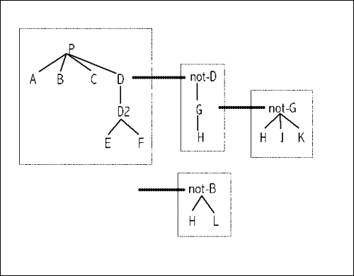
With the
advent of HTML, and inspired by the encapsulation of dialogues into
separate windows in computer GUI’s, we proposed simplifying
the diagrams further by removing all of the arrows. Support
relations would be implicit in the narrowest containments. All
containments after that would be of dialectical significance:
left-to-right for countering, rebutting, or undercutting;
top-to-bottom for alternate attacks of the same argument.
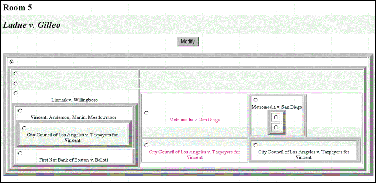
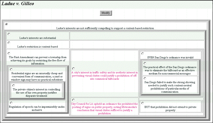
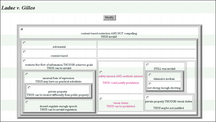
We even
proposed several views of arguments in this encapsulated form, where
one view gave the authorities of the claims, another gave a
paraphrase, and yet another gave a simplified logical form.
(from
Loui)6


But we
were crestfallen to realise that this form derives much of its
intuitiveness from the simple two-column outline form that is
familiar to high school debate participants.
For
example,
could be
written as
|
P
A
B
C
D
D2 not-D2
E G
F H
not-G
H
J
K
|
with no
loss of visual clarity.
This two
column form, “debate-form,” is not entirely satisfying,
as here it permits the lines for E and F's support of D2 to collide
with the lines for G and H’s support of not-D2. E and G share
lines, but their sharing has a different semantics from D2 and
not-D2 sharing a line. Where would a counterargument against E be
placed in this scheme? Moreover, the semantic overloading of the
line is exacerbated if we permit the third column and make no
provision for overlapping lines (E bears no relation to not-G, and
they share a line):
|
P
A
B
C
D
D2 not-D2
E G not-G
F H H
J
K
|
But the
reality is that the semantics of boxes within boxes is not so
transparent, and strict adherence to too many encapsulation rules
can actually decrease comprehension. The main advantage of the
boxes is that they permit a rotation from top-down to left-right for
lists of supporting propositions.
For the
diagram,
the
equivalent naive outline,
|
P
A
B
C
D
D2 not-D2
E G not-G
F H H
J
K
not-D2
H
L
|
is really
equally useful, if a bit ad hoc. And any attempt to clarify the
semantics of a line by imposing a push-and-pop spatial grammar
(e.g., the left-hand-side contiguity always defers to the
right-hand-side, during a counterargument) simply ruins the visual
appeal. The proper rendering, while preserving line semantics,
decreases density and reduces juxtaposition within arguments, thus
increasing scan effort:
|
P
A
B
C
D
D2 not-D2
G not-G
H
J
K
H
not-D2
H
L
E
F
|
These are
exactly the considerations that first led to our adoption of
encapsulation.
4. Web
Markup, Dynamics, and Animation
We are
now all familiar with the font control and dynamics of HTML, and the
possibilities for rendering argument are dizzying. Not only did we
use color to differentiate PRO’s and CON’s positions
above, but we could have used size and style, face and font-weight
as well. All of the original CSCW argument systems were precursors
of hypertext systems, so their authors envisioned actions of hiding
and unhiding upon user action.
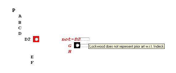
For
example, the outline form above seems not so sparse when
counterarguments can be hidden or restored from hiding. Thus,
|
P
A
B
C
D
D2
 
E
F
|
might
display the main argument, whereupon clicking on the box next to D2
exposes the argument for not-D2, and further options for exploring
counterarguments.
|
P
A
B
C
D
D2 not-D2
G

H
E
F
|
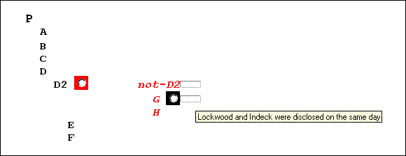
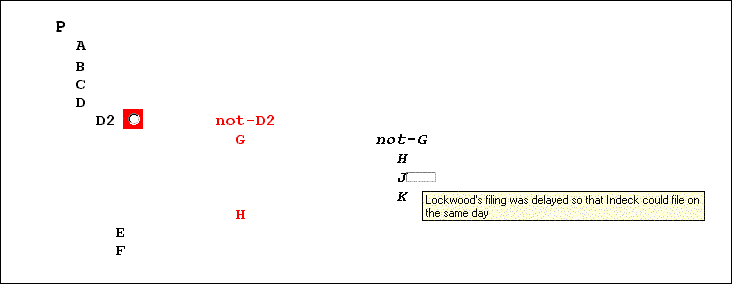
Interface
dynamics might include a mouseover or pop-up window for viewing
longer forms of the claim, or viewing the authorities of the
defeasible rules when mousing over the “links”.


In the
extreme, animations could be used, which would be difficult to print
in a paper such as this, even with screen captures. Animations
could show not only the historical development of the dialogue or
its dialectical structure; animations could also be used to show the
differing views of the state of the dispute, especially as
participants were willing to accept certain assertions,
presumptions, or defeat relations among competing arguments.
5. A
Plea for Structure over Style
No doubt,
the enterprising software interface designer has already thought of
connecting Microsoft Word functions and Adobe Photoshop tools to the
layout of arguments. Why not check the spelling and grammar? How
about smart quotes and a minimum font size?
There is
a fine line between aiding the thought process that underlies the
formation of rational beliefs, and the markup of text for its own
sake, or for mainly stylistic purposes. Of course, persuasion may
indeed at times require style. It is simply good practice to be as
clear as possible, and style helps. Perhaps the rhetorical desire
to produce multi-column aligned outlines would eventually be
satisfied by authors of PowerPoint providing some kind of columnar
text support for PRO/CON presentations.
Our real
interest in diagramming arguments derives from a desire to
understand structure as sophisticates. It seems our natural
obligation to offer symbolic regimes that sometimes go far beyond
the work-a-day visualisations. It would be folly to impose complex
structure on all argumentative forms. Even when the argument could
be diagrammed so as to expose inherent specific structure, the
academic must recognise that the practitioner need not do so. Even
when the user could use a template with more numerous
well-formedness constraints, the programmer must recognise her right
to use a simpler template. Still, our job is to invent those
templates.
Here are
two forms that derive from the analysis of legal reasoning from
precedent. These are simple diagrams, but have had no real hearing
in the community of those who like diagramming.
The
first is the idea of Kevin Ashley, in HYPO.7
The idea begins simply enough: a present case is related to a
prior case by the enumeration of its similarities and
dissimilarities.
To
argue P on the basis of a past case exhibiting A, B, C, and D, one
need only remark that the current case has A and B in common, has C
as a distinction, did not report on D, and has an added fact of
possible relevance, E, that was not reported in the precedent. We
can find this basic idea in Raz,8
complete with letters A through E.
|
PrecedentCase
P
A
B
C
D
E |
CurrentCase
P
A
B
not-C
|
Without
going into too much detail, Ashley proposes an improvement of this
model for the restricted domain of reasoning about trade secrets
violations. He manually determines the dimensions along which
precedent cases and current cases may be compared for similarity.
He identifies each dimension as inherently pro-plaintiff or
pro-defendant so that reasoning can be augmented by dimensions, or
factors, that are not present in past cases.
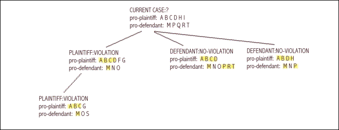
The
result is a “claim lattice,” which is intended to show
the most on-point cases for plaintiff and defendant, based on
subset-relations among factors and the inclusion of additional
pro-plaintiff factors by the plaintiff, the omission of additional
pro-defendant factors by the plaintiff, the inclusion of additional
pro-defendant factors by the defendant, or the omission of
additional pro-plaintiff factors by the defendant.

The
second template, or argument form, is the generalisation and
possible improvement of Ashley’s analysis, according to my
co-author, Jeff Norman, and myself.9
(This in turn may have been improved by Prakken and Sartor,
depending on what you think of analogies that are based on quite a
bit less similarity.10)
The main
idea here is to record the actual disputation tree from the past
case. An attempt to make use of a past case’s argumentation
is not just a listing of similarities, but a recall, re-enactment or
re-citation of the past arguments, to the extent that they can be
made in the current context. The synthetic contribution of the
prior case is the judicial decision that one argument defeated
another in the past case; hence, that same argument should defeat
the same counterargument in the current case, all things being
equal. However, if the past case’s main argument survived a
counterargument in the presence of a reinstating argument, and if
that reinstating argument is not available to the arguers of the
current case, then the authority of the past case is dubious.
What can
be visualised in this scheme are the past relationships among
arguments, and the current context’s ability to recall each of
those arguments, in part or in whole.

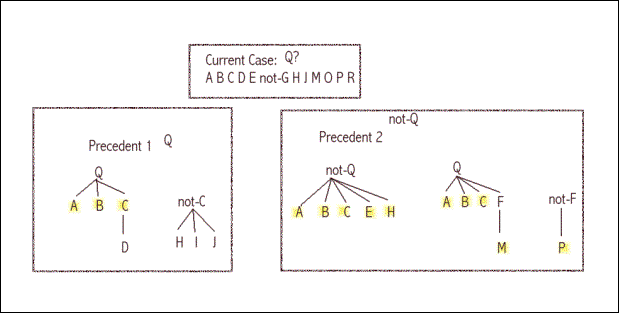
Here,
Precedent1 and Precedent2 appear to conflict over the conclusion of
Q in the current case. But the relevant similarities are not “A
B C D H J” versus “A B C E H M P,” which is an
indeterminate contest. The relevance of Precedent1 is that the “A
B C for Q” argument can be made. The counterargument that was
disfavored in Precedent1 is irrelevant in the current case because C
is not a current issue. Meanwhile, Precedent2 contains three
arguments, all of which can be made in the current fact situation,
and the argument for Q in Precedent2 is actually stronger than the
argument for Q in Precedent1. Nevertheless, at least in the context
of the disrupting argument “P for not-F,” the “A B
C E H for not-Q” argument was preferred in Precedent2. Thus,
Precedent2’s decision is authoritative here.
Perhaps
not so many case-based analogical arguments in the real world can
benefit from this kind of analysis, but I believe this kind of
argument diagramming, and the ambition to provide a calculus of
rationality, should not be lost as we see stylistic markup
proliferate among GUI tools for argumentation and cooperative
problem solving.
No
less a figure than Cass Sunstein pronounced HYPO to be inadequate as
an account of general legal analogy, at a conference sponsored by
Chicago Law Review students about a decade
ago.11
However, all of his concerns appear to my eyes to be addressed in
this deeper, argument-based model of the case. I do look forward to
legal scholars’ reactions to this subsequent modeling of the
logic of analogical reasoning. It has been almost fifteen years
since we proposed it, and HYPO itself is now over twenty years old.
It is a bit unfair to be looking at first generation models when
judging the entire AI and Law field.
6. Jonathan
Swift’s Modest Proposal
The
title of this talk contains the phrase “Modest Proposal,”
and there is a certain obligation to live up to Jonathan Swift’s
legacy.12
If there were something as outrageous as the famine of Irish
families in the world of argument visualisation, I would not
hesitate to stryke a satyrical tone. Perhaps if a generation of
lawyers had grown too enamored of Toulmin spaghetti diagrams, it
would be high time to suggest that we feed them a carb-free diet of
old-fashioned prosodic meat.
I had in
mind the unambitious annotation of an argument with the
warrant-status of all hidden arguments: red for a defeating counter
argument, pink for an interfering counterargument, pale pink-gray
for a defeated putative counterargument, black for an effective
reinstater, and gray for an ineffective putative reinstater.
Parentheses could be used to group the dialectical chains. D2 below
has a putative interferer that is defeated by a reinstater, but also
has an actual interferer with no rebuttal.
I have
indicated the warrant status of P with a gray surrounding box
instead of a black surrounding box because of the existence of the
unrebutted interferer. Visually, one can see immediately that this
is an argument supported on four main points, with one deep
(potentially weak) chain, where a counterargument has been rebutted
and another counterargument has not been.
But
thinking further, and a bit lightly, about how arguments could be
annotated based on their warrant status and apparent strength, I am
happy to suggest the following markup.
Here is
how you would indicate that an argument is little tested, but
inherently sound, has unusually wide appeal, and is probably an
argument that you would not want to have to defeat.
|
P
A
B
C
D
D2
E
F
|

|
Here is
an argument you have been waiting to make for some time, which you
expect would be a very good argument, that is, if there isn’t
a better argument to be found; and it is a familiar argument that
has survived many pointed attacks in the past.
|
P
A
D
D2
E
F
|

|
And here
is an argument that you just do not want to be making, an argument
that many may have made in the past with good intentions, an
argument that derives from a very strong precedent, but an argument
that has far too many points that are now simply indefensible.
|
not-P
C
D
F
|

|
Finally,
this is a fantasy view of how the dialectical state of longstanding
and well-understood arguments might be visualised, taking mainly
into account the potential strength of each.
7. Conclusion
We began
wanting only to improve on Toulmin diagrams by using encapsulation
instead of boxes and arrows (the same basic idea is used in any
Window-based graphical user interface). The same organisational
components were found to be available to highly disciplined
multi-column outline forms, where indenting with vertical
progression indicated subordinate support, and horizontal
progression indicated counterargument. These diagrams were
difficult to read, however. Part of what made these diagrams
unwieldy was their inability to hide uninteresting parts of the
dialectical state. It was then suggested that dynamics could be
used to open and close argument details, in the same way that users
interact with folders and subfolders of files in many common
software programs today. There were suddenly many possible ways
that interaction could alternately hide and reveal information.
More interestingly, the graphical object used to summarise a hidden
argument could convey information about the argument’s force
or validity: a consistent coloring of red for undefeated arguments
and black for defeated arguments could be used, for example.
Meanwhile, we noted that there were many interesting structural
devices, corresponding to logical constraints of specific argument
forms, that should be considered in the diagramming of arguments.
To ignore structure at the expense of graphical devices seemed an
unending walk into the world of text decoration, even web design.
Finally, we suggested, half-satirically, that a more cogent and
powerful visual shorthand could be found in simple metaphors to
politics and other orders of combat.
*
Professor in Computer Sciences, Department of Computer Sciences and
Engineering, Washington University, St. Louis, [email protected].
1
R Loui, J Norman, JAltepeter, D Pinkard, D Craven, J
Linsday, M Foltz, “Progress on Room 5: a testbed for
public interactive semi-formal legal argumentation”, 1997,
Proceedings of the 6th International
Conference on Artificial intelligence and Law,
pp.207-214.
2
S Toulmin, The Uses
of Argument (1958).
3
C Marshall, F G Halasz, R A Rogers, W C Janssen,
“Aquanet: A Hypertext Tool to Hold Your Knowledge in Place”,
1991, Proceedings of ACM Hypertext,
San Antonio, TX, 261-275.
4
C Chesñevar, A Maguitman, R Loui, “Logical
Models of Argument'” (2000) 32 (4) ACM
Computing Surveys, pp. 343-387.
5
N Rescher, Dialectics:
A Controversy-Oriented Approach to the Theory of Knowledge
(1977).
6
R Loui, J Norman, J Altepeter, D Pinkard, D Craven, J Linsday, M
Foltz, “Progress on Room 5: a testbed for public
interactive semi-formal legal argumentation”, 1997,
Proceedings of the 6th International Conference on Artificial
intelligence and Law, pp.207-214.
7
K Ashley, Modeling
Legal Arguments: Reasoning with Cases and Hypotheticals
(1991).
8
J Raz, The Authority of Law
(1997).
9
R Loui, J Norman, “Eliding the arguments of
cases,” 1997, unpublished paper presented at the International
Association for Philosophy of Law and Social Philosophy (IVR),
Buenos Aires.
10
H Prakken, G Sartor, “Reasoning about
precedents in a dialogue game”, 1997, Proceedings
of the 6th
International Conference on Artificial intelligence and Law,
pp.1-9.
11
L K Branting, K Ashley, C Sunstein, “Legal
Reasoning & Artificial Intelligence: How Computers ‘Think’
Like Lawyers” (2001) 8 (1) University
of Chicago Law School Roundtable.
12
J Swift, A
Modest Proposal and Other Satirical Works
(1996)
BAILII:
Copyright Policy |
Disclaimers |
Privacy Policy |
Feedback |
Donate to BAILII
URL: https://www.bailii.org/uk/other/journals/Script-ed/2008/5_1_SCRIPT-ed_176.html


